Dashboard Reports provide a comprehensive overview of a Group’s or Location’s performance indicators in real time. These reports not only allow management to monitor progress but also help ensure that service standards are consistently met. By capturing and presenting key performance data, Dashboard Reports enhance the quality of feedback collected from guests. This feedback can then be transformed into relevant, meaningful, and actionable insights—empowering frontline staff to improve service delivery, address issues promptly, and continuously elevate the guest experience.
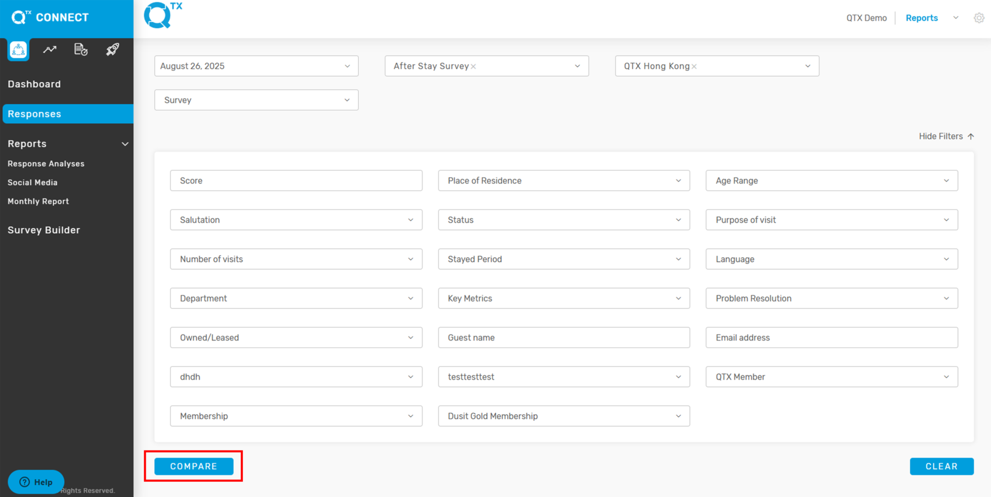
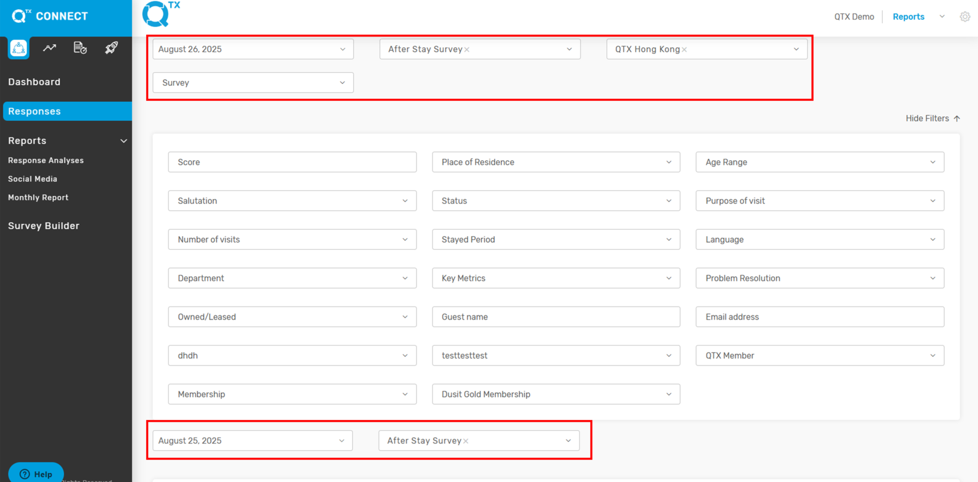
1. On the Dashboard, enter the required information using the Filters function.

2. On the same page, hovering the cursor over the Response Ratio Rate will display details such as Surveys Sent and Responses Received from the assessment.

3. For the Key Metrics Score, hover the cursor over the line to view the standard associated with the score.

4. Satisfaction Rate – Hovering the cursor over the graph bar will display the outlet’s satisfaction rate along with the number of responses received.

5. Click “SHOW MORE” to display the complete details.

6. The Name, Satisfaction Rate (%), and Number of Responses will be displayed.

7. The Top 5 and Bottom 5 Areas, along with their corresponding scores, are displayed for easy reference. By reviewing this information, management can quickly identify the best-performing and lowest-performing departments based on the set standards. Scores below 80% are highlighted in yellow for visibility.

8. You will also see the Responses and Problem Resolution sections below the Top 5 and Bottom 5 areas. By hovering over the arrow, you can view additional responses provided by the system.

9. Response Ratio – Hovering the cursor over the graph line will display the number of surveys sent and the number of responses received. The graph can be customized to show either Surveys Sent or Responses Received by selecting the relevant checkbox.

If you need further assistance, please send an email to helpdesk@q-tx.com